Robert’s Manufacturing
The Challenge
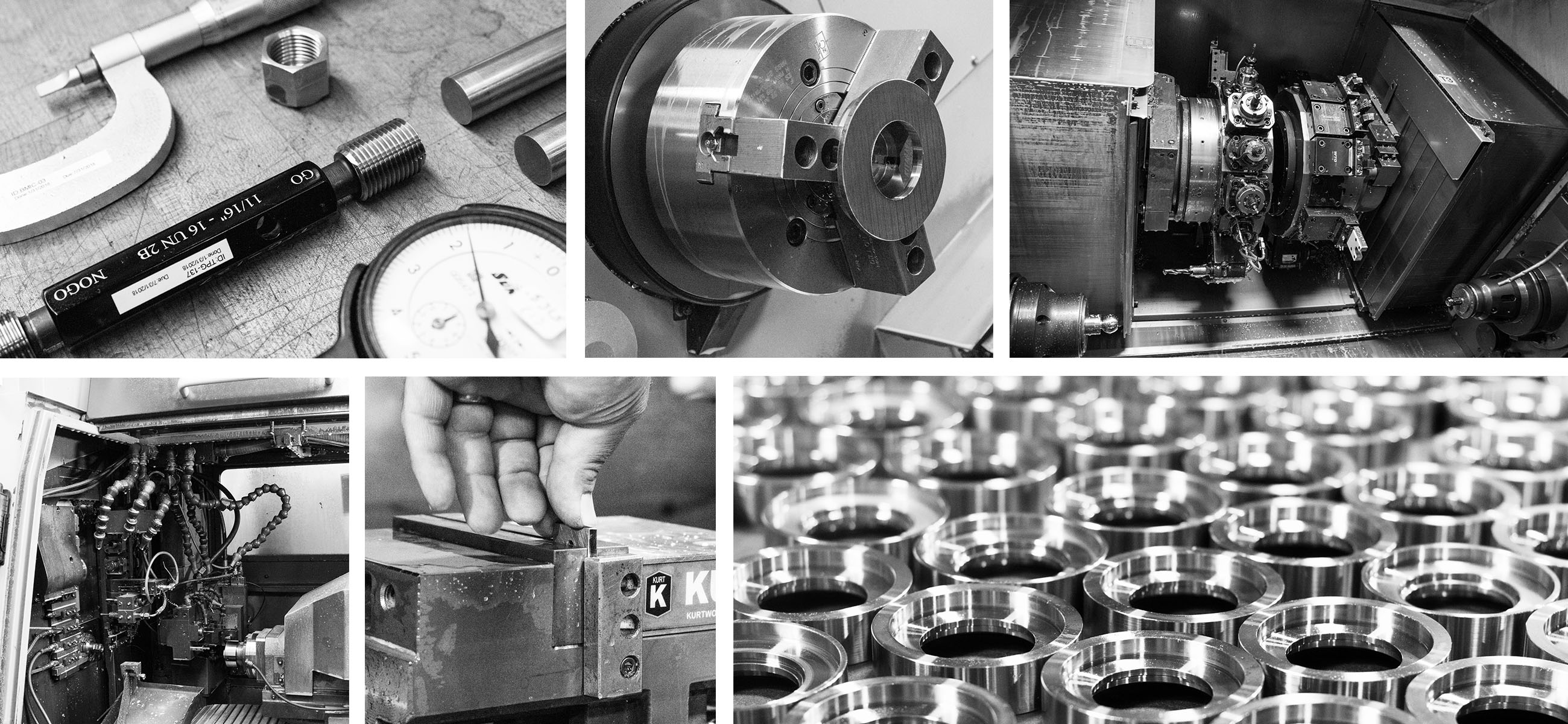
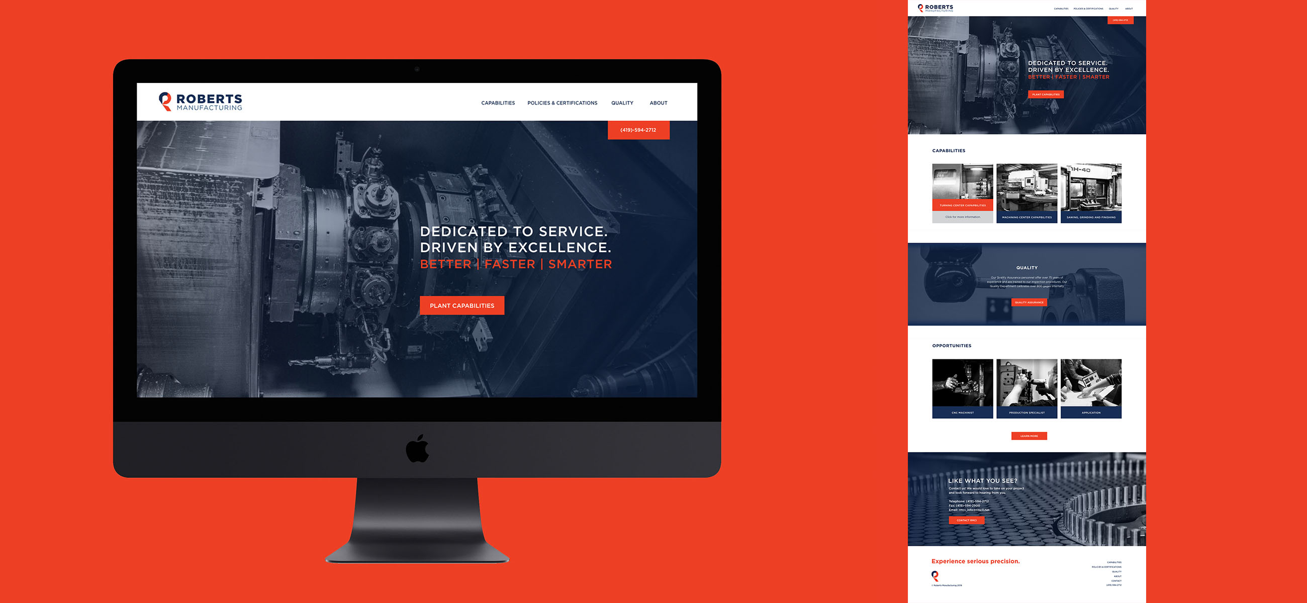
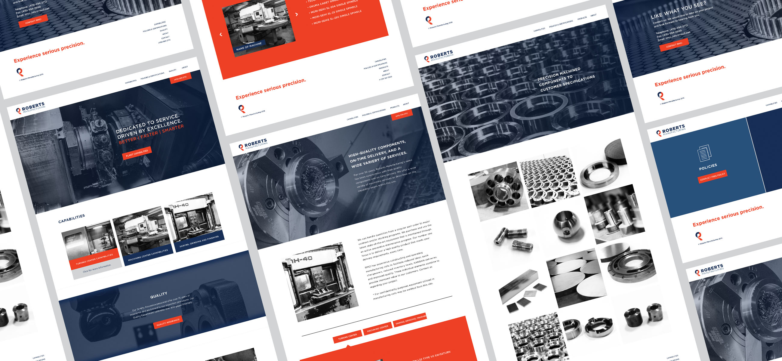
Robert’s Manufacturing needed Vesst to rebrand their company and give their website new life. Along with this, we were tasked with photographing the warehouse and some of the products that the machinery produces.
Our Approach
Go bold. We didn't want Robert's to be lost in the sea of manufacturers that they're competing with. Keeping things bold, between photography and brand colors, Robert's has become a company in this industry that is easy to remember.
Branding
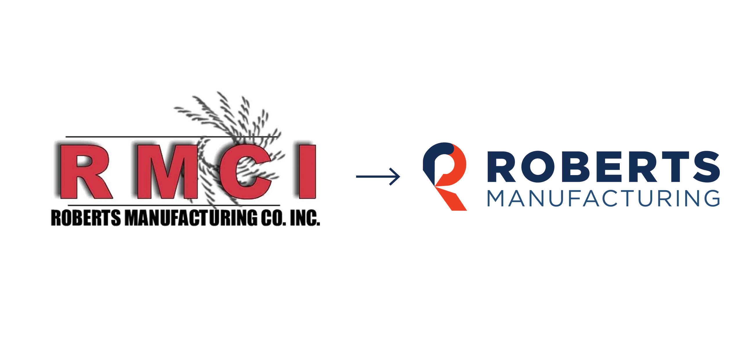
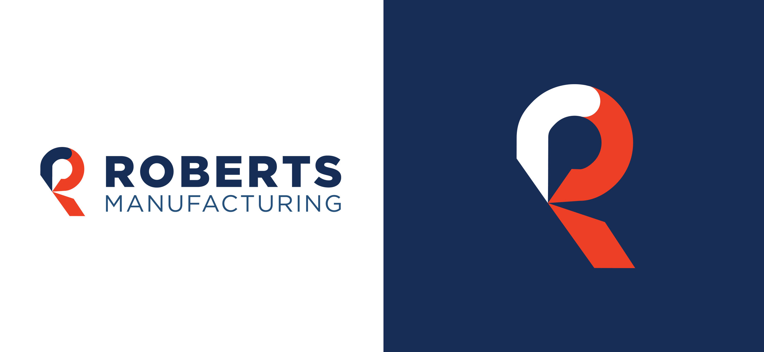
A distinguished mark is going to put Robert’s Manufacturing ahead of their competition, as they will quickly start to become recognizable, with something as simple as a bold “R”. The “R” mark not only stands for Robert’s, but also uniquely shows what the company can do for you. The mark mimics sharp, precise cuts and adopts shapes from products that are made in their warehouse every day. The new brand colors are masculine and lively. The navy blue is inviting and the pop of orange stands out, similar to the way that Robert’s stands out in the industry with their one-of-a-kind machinery.

Website
Bold photography, portraying the exact equipment you can find in Robert’s Manufacturing warehouse, is just the punch a company like Robert’s needs when someone lands on their site. It is a different approach to what could be a very copy-heavy, dull website. The blue and orange color scheme brings the site to life and keeps the user engaged, whether that be a manufacturing expert or not.
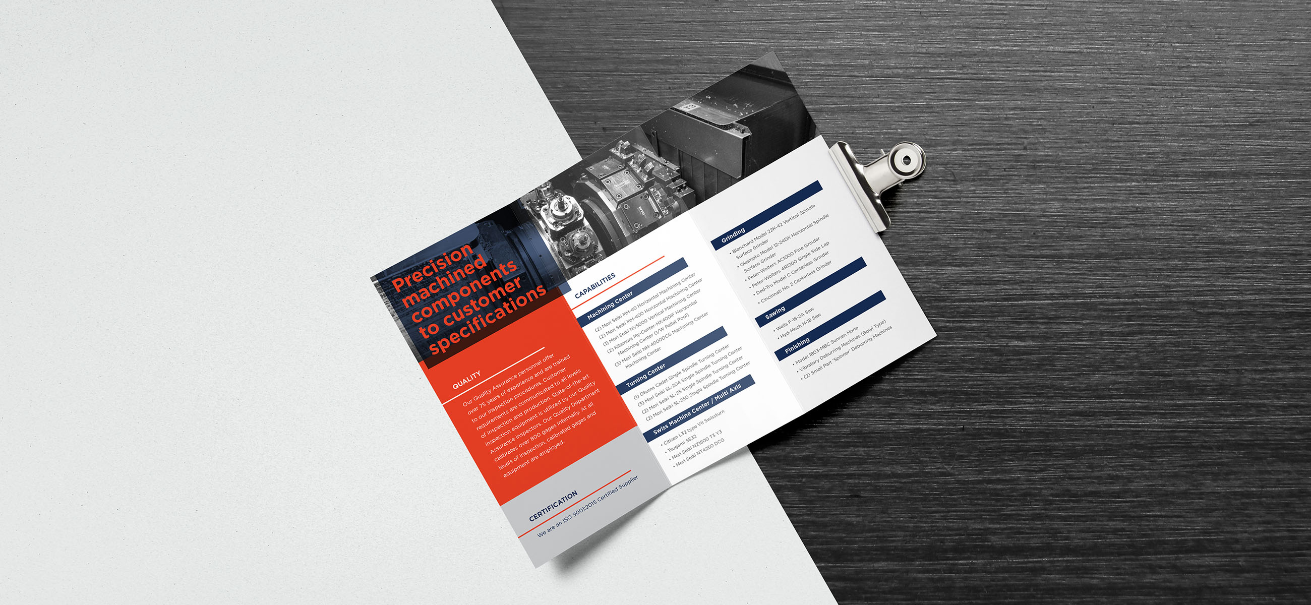
Brochure
More often than not, clients reach out to Robert’s for help, however, there are times when it is critical for the company to search for, and win over, new clients to work with. In order to do so, they needed a brochure to pass out when meeting these potential clients. We kept it simple; we listed the machines they have in-house, the quality standards they obtain, and the certifications they’ve earned. A multitude of helpful information in a single page brochure.