Birch & Bell Boutique
The Challenge
Create a logo and stationery that could be used by the online boutique.

Our Branding Approach
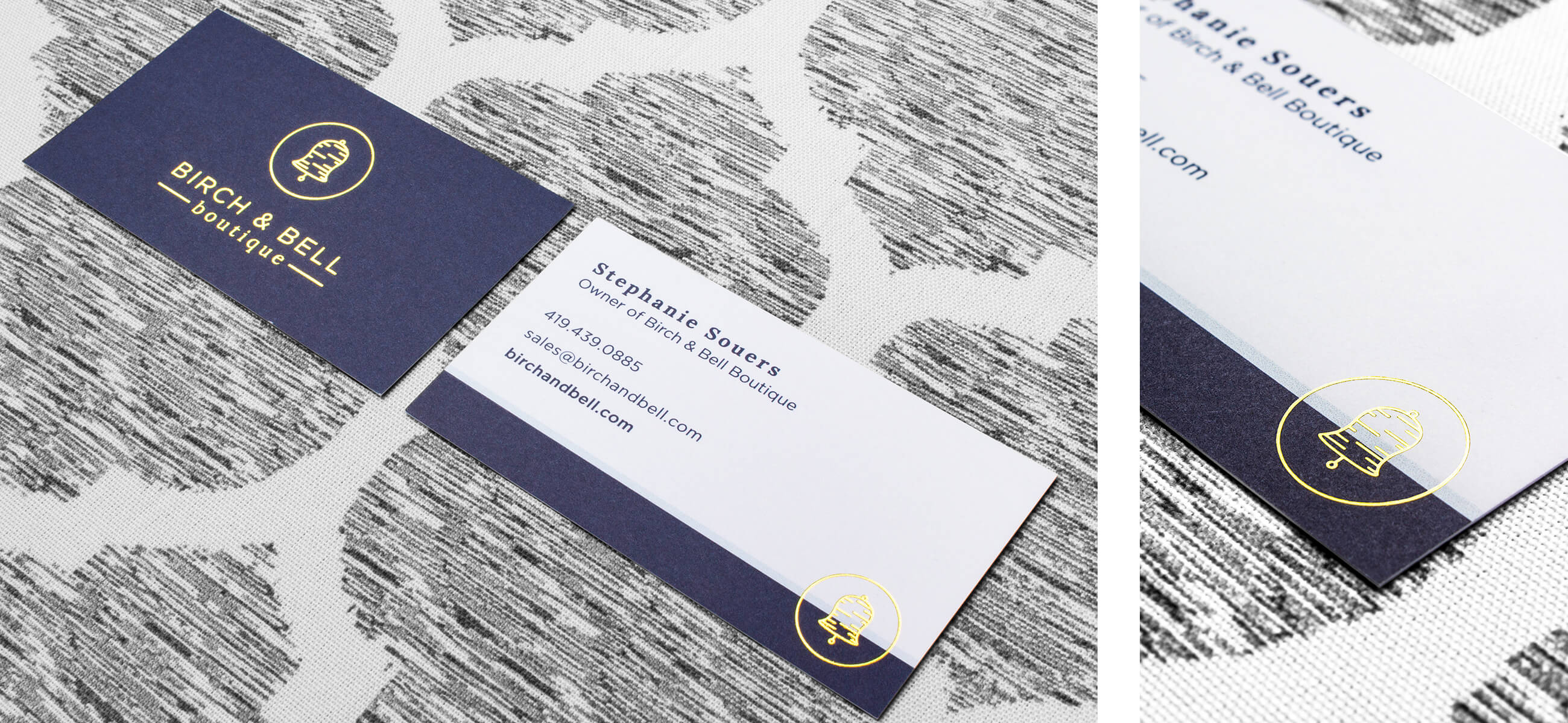
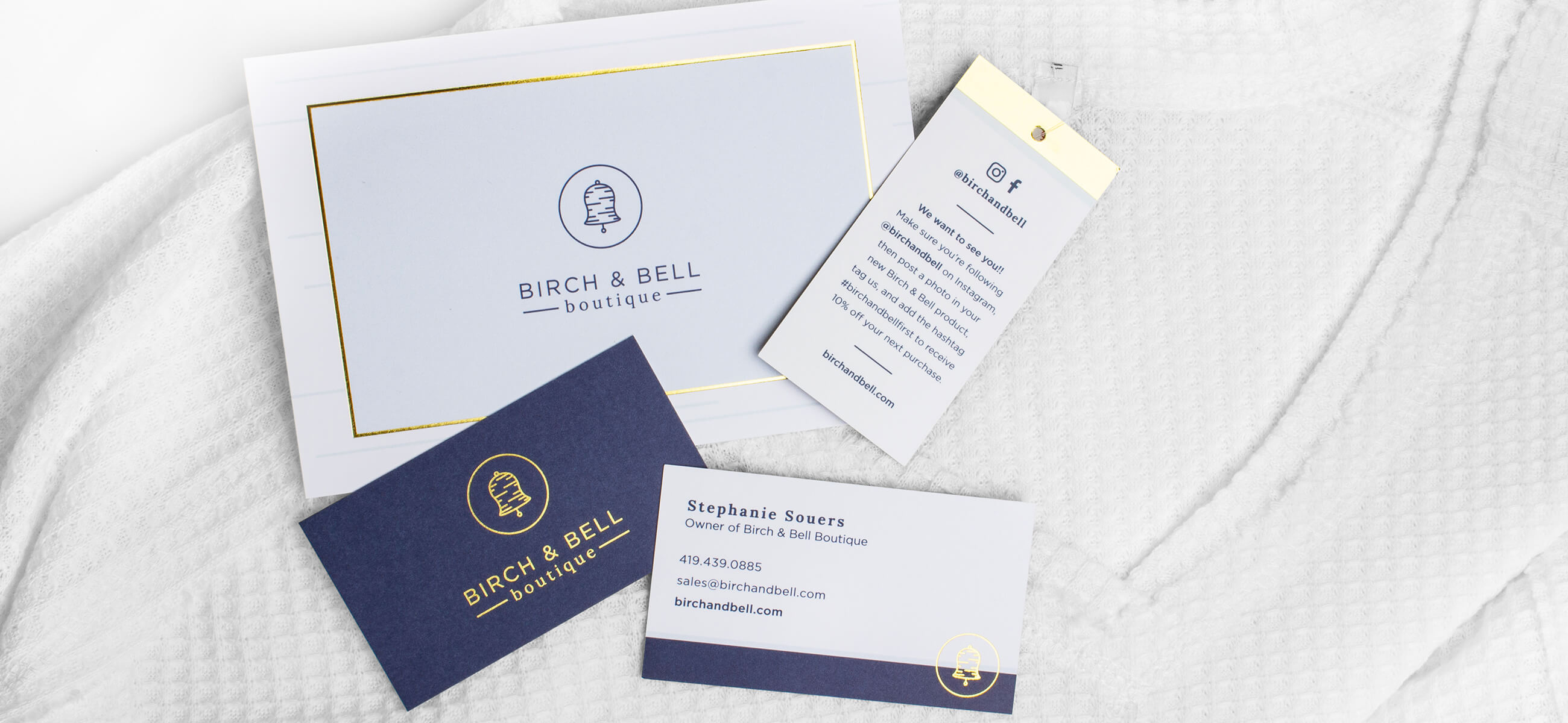
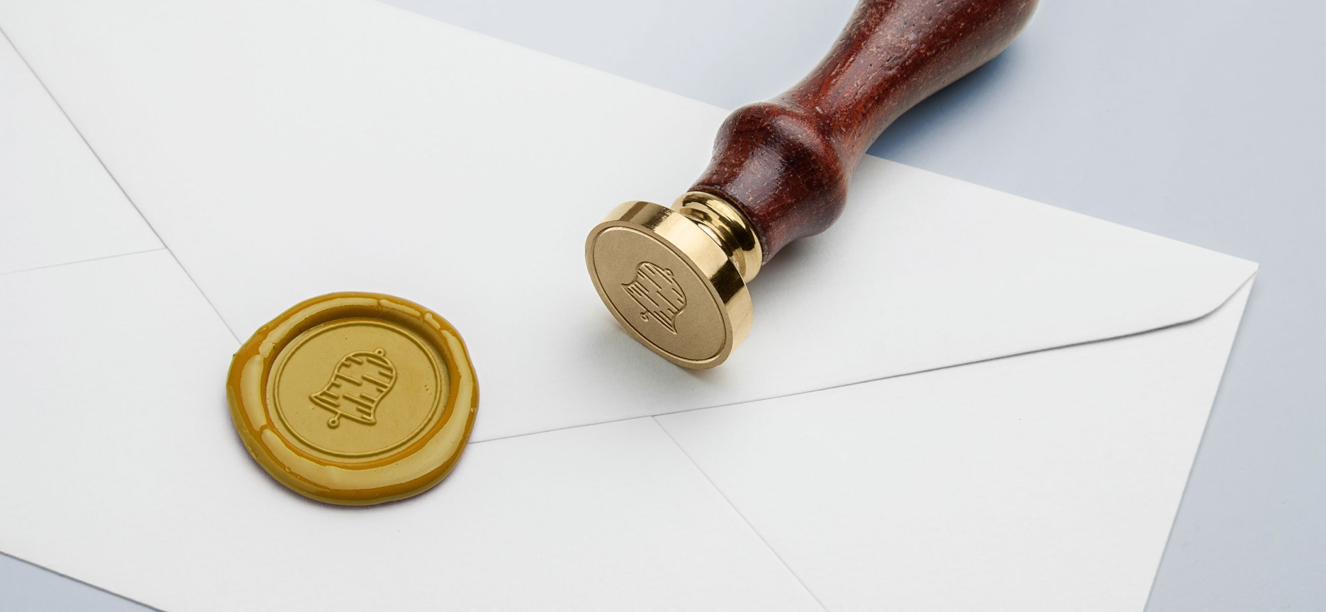
A logo and brand that is timeless, simple, and memorable. The logo is fresh, young, and clean. It ties the name of the company together in its mark, showing a birch pattern masked inside of a bell shape. The type used illustrates a “mix & match” approach using a serif and sans serif font. The message of mix and match is easily seen on online boutiques, as the customer has many options to mix this top or that top with these bottoms; or match this top with this skirt. We wanted the brand to feel inviting, light, and airy. We started with the navy blue and added some lighter blues and purples to compliment the navy. A pop of gold adds a twist of luxury and an eye-catching detail to the boutique's stationery.


Stationery
In order to differentiate her company from other online boutiques, the owner of the boutique wanted to be able to write handwritten notes to anyone who made a purchase at Birch & Bell. We designed the note cards with the logo, a subtle light blue birch background, and a gold foil detail that, with a sweet message, is going to delight any customer. We also wanted to create a social media push and we were able to do so with the hangtags that come with each product that you buy. As she is just starting out, the hangtag gives a 10% discount to those who purchase something from Birch & Bell. To receive the discount, one has to post an image on Instagram in the recently purchased item from B&B with the Birch & Bell account tagged and the hashtag #birchandbellfirst. Business cards with an eye-catching gold pop and branded stickers portraying the brand icon complete this stationery set.