We helped Midwest Community tell their story through a bold new identity, a new marketing strategy, and a robust online experience.
Midwest Community Federal Credit Union
The Challenge
Midwest Community approached us to upgrade and build a website. In the process, through research, we uncovered that their current brand didn't match their mission and vision. We needed to re-energize their brand towards an engaging, fun, and modern look. Most of their current analytic efforts were non-existent. Through the makeover we were not only tasked to brand multiple platforms, but had to build a complete auditing system to track the changes throughout the site.

Our Approach
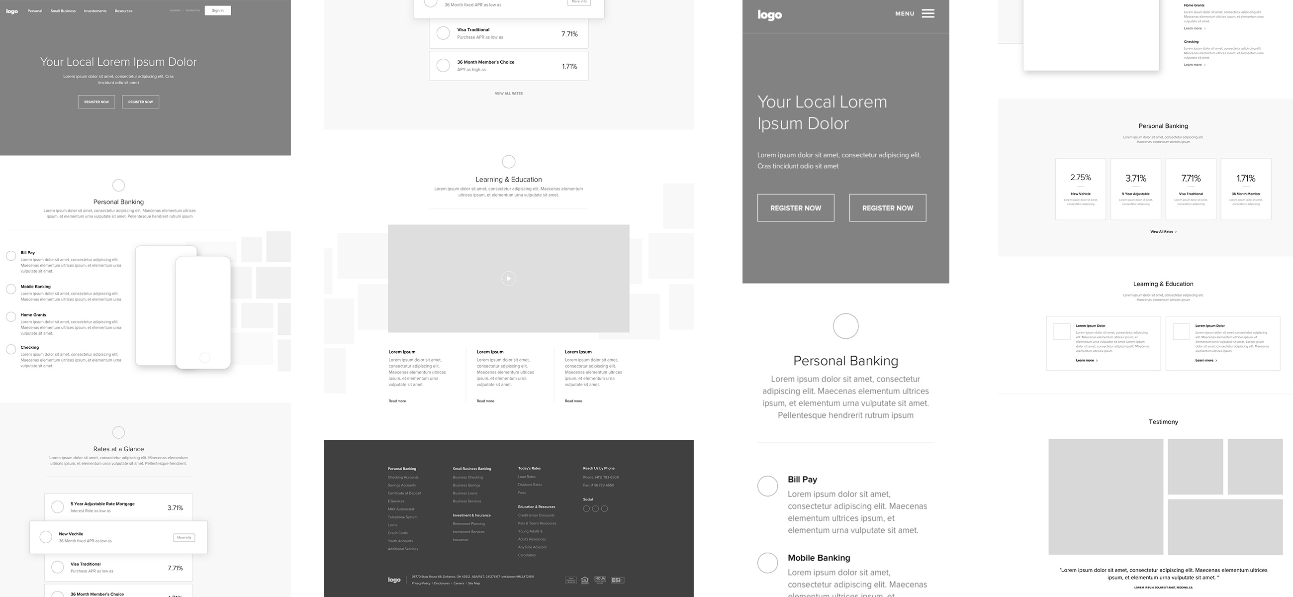
At the beginning of the project, it was very clear our entire team needed to put their hands into each part of the rebrand and website build. Each word, color, concept and idea was strategically thought through. To quickly gain momentum, we started with wireframing the website to gain an overall picture of what story we want to tell. Then we applied colors and a typeface after the main goals were achieved.
Branding
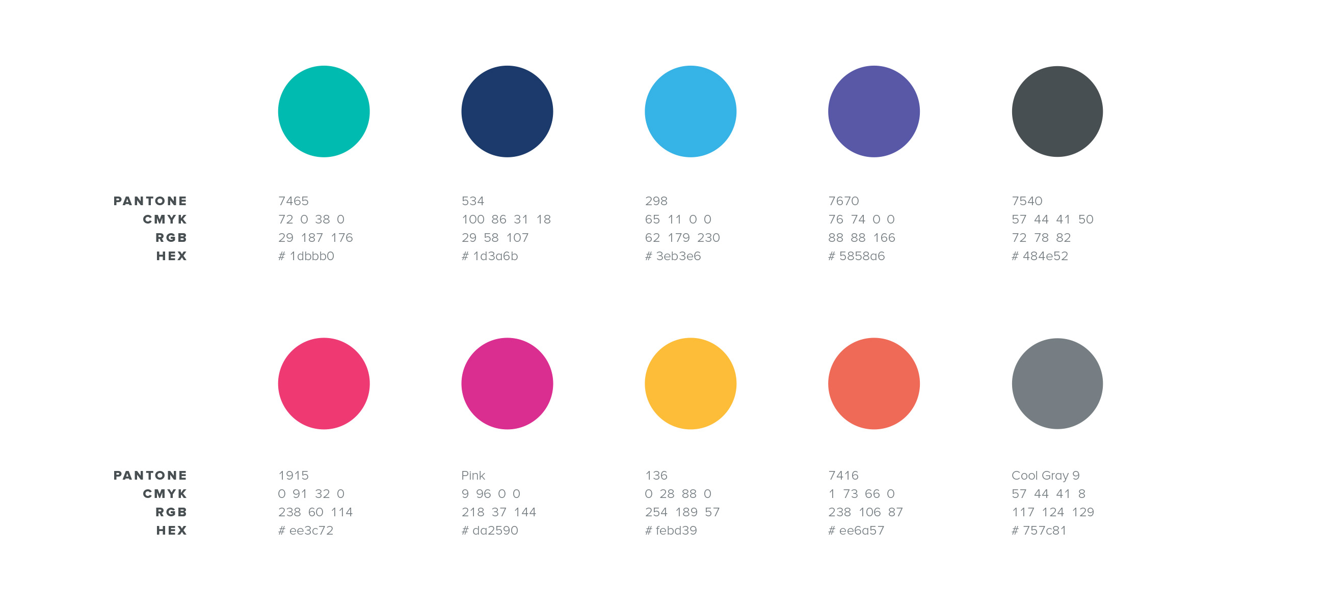
The brand strategy was built around a color palette that could speak many voices into one message. A clear confident tone of voice was applied to each visual to feel enjoyable and simple, yet powerful. Navy and teal were chosen to be the main colors with many different options for secondary colors. We also updated the curves and avatar on the logo, but kept the font the exact same to keep a consistent look for Midwest's members.

Presentation
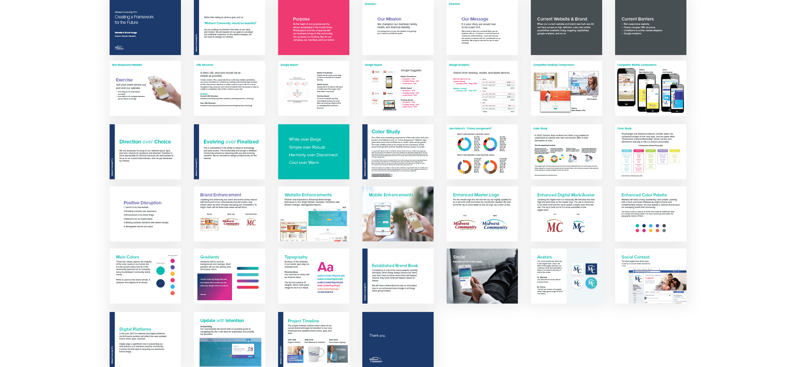
We needed to prepare a presentation to inform sales and CSR's about the updated brand and new website that would be launched. A fun, engaging meeting was set and a question and answer session was held after. During this time, Vesst answered questions and discussed the timeline including what, and when, things will be changing and how everyone's daily work would change for the better.

UX/UI Design
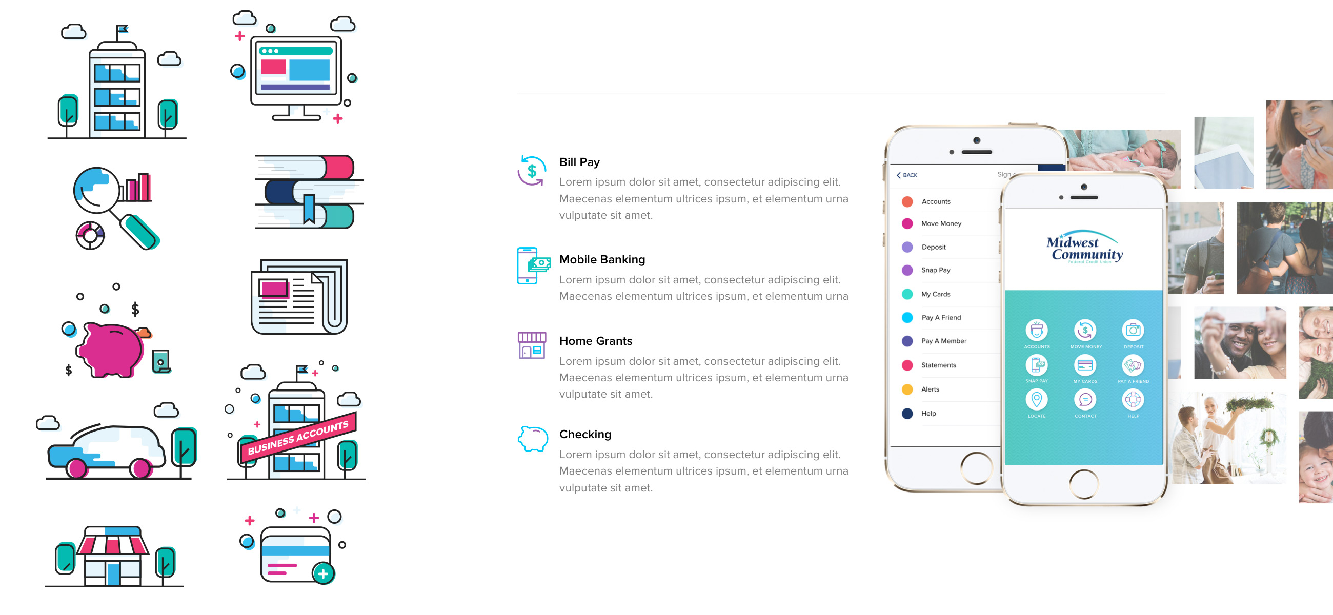
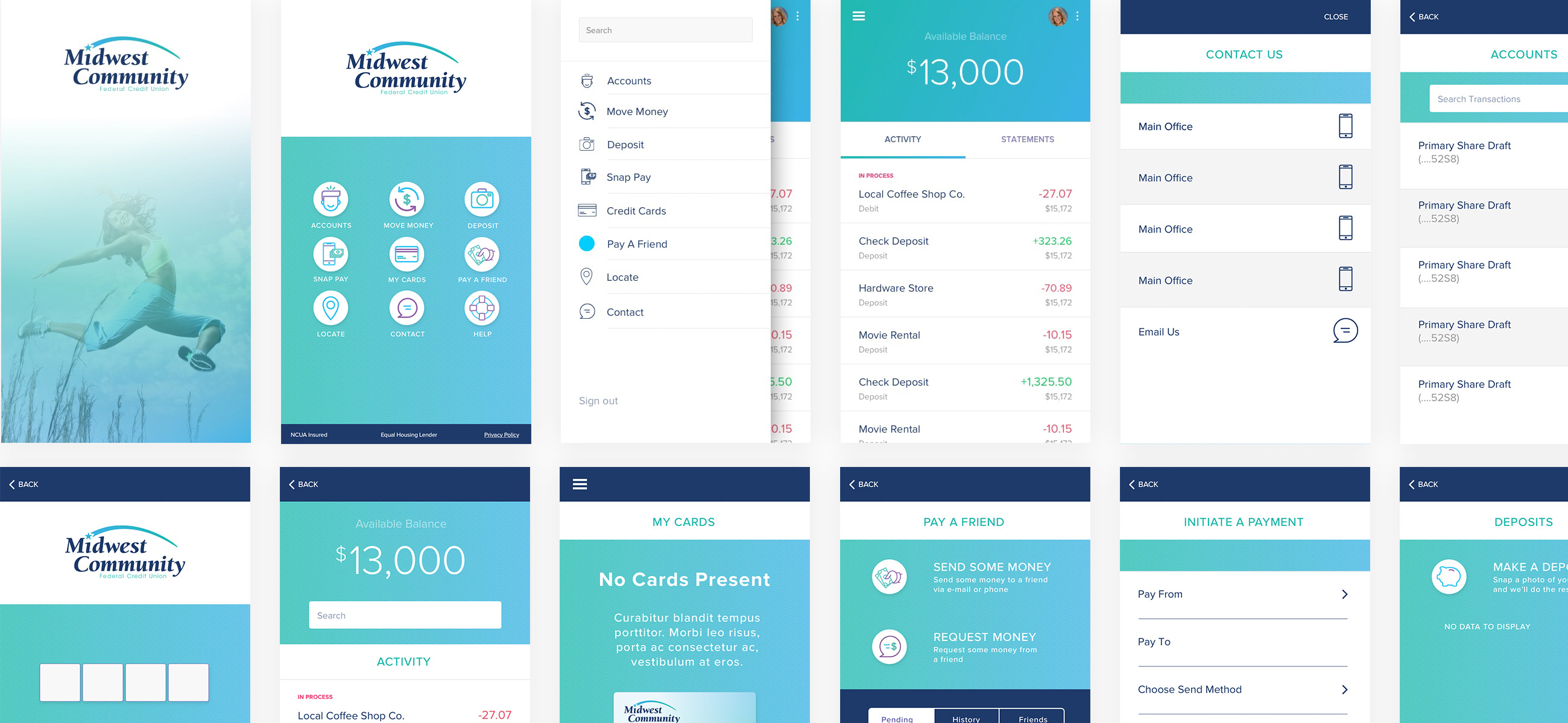
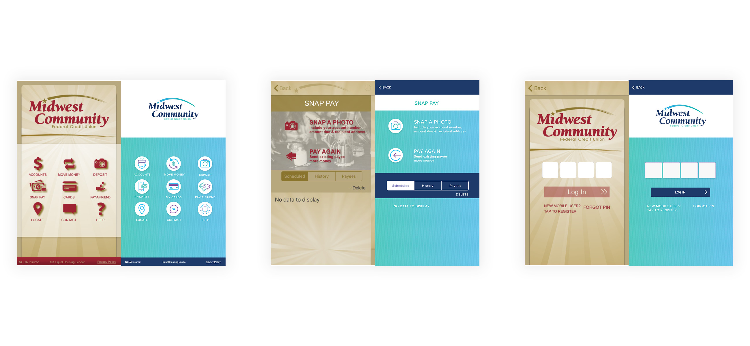
Along with a site redesign, we laid out Midwest's app. The new setup is easier to navigate, has better flow between screens, and solves issues some have experienced with their old application. We developed a custom icon for each screen. The app is now used as the key account in showing off what your credit union application should look like.
User Accounts
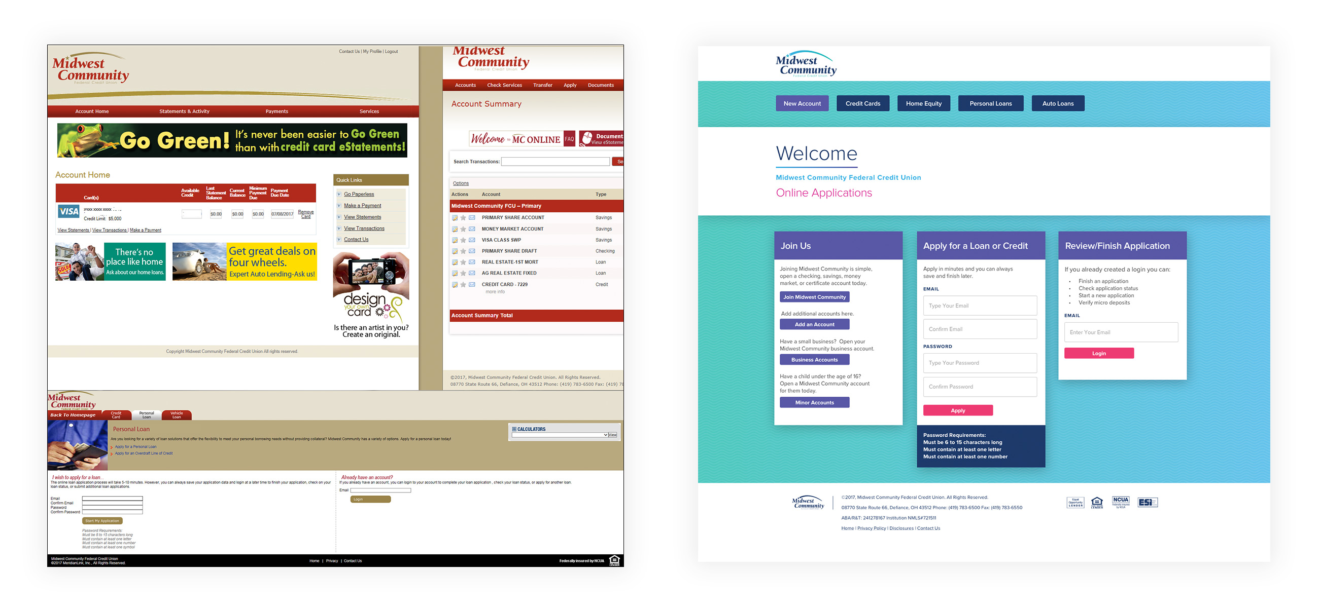
Midwest has many different third party applications and software that fit the needs of its members. Each application needed a redesign. We worked with requirements and fit the needs of each software and application to make Midwest stand out in front of its competitors.

Development & Auditing
We developed an HTML, CSS, and JS base that could adapt and grow as Midwest needs. Each section built is modular and can be reused, but is custom enough to not look like a template. This responsive website was built in Wordpress and follows many different measures to ensure security throughout the site. Midwest was printing out page history to log all changes and approvals. That was not good. We set up the Midwest site as a Dev -> Test -> Production platform. Each code change is tracked and placed into a git/bitbucket history log. Midwest is also required to track all content changes. To solve this task, we built a robust tracking and exporting application that tracks Wordpress revisions. With the revision history, you can export PDF's or CSV's from specific dates and pages. A 100% customizable export for whatever audits they track.
